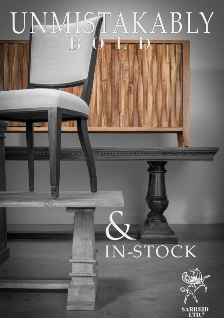
Unmistakably Sarreid places the furniture center stage to reflect its style footprint in the marketplace
WILSON, N.C. – Luxury case goods and upholstery resource Sarreid Ltd. has undertaken a brand repositioning that both simplifies and elevates its web presence while also conveying the depth of fashion and style throughout its line.
The new look positions black and gray tones – in both wood finishes and black and white photography – with pops of color on case goods and upholstery, such as consoles in light and bright multi-hued finishes and leather accent chairs in soft brown tones.
Bearing a bold title line that reads “Unmistakably Sarreid,” the site focuses on how the line stands out on retail floors based on customers’ perceptions of the line. It also touches on what customers are seeking in today’s marketplace with sections highlighting what’s new, what’s in stock and how to open an account.

Featuring images shot in the company’s onsite photo studio, the look and feel of the website is consistent with the company’s marketing and advertising – including its messaging on social media, a key element of its marketing push, noted Brad Cates, CEO. He added that at the spring market, customers also will see the same aesthetic in the design and layout of its showroom on the third floor of the C&D Building.
For Cates, it was important to have a strong and elegant visual presentation for retailers and designers alike, who shop many different high end showrooms. Seeking inspiration from other high end automobile and fashion brands – ranging from Bentley and Mercedes-Benz to Prada and Louis Vuitton – the goal was to position the brand in a new light.
“At the end of the day, I am an artist and a painter, and I see things graphically.” Cates said. “Within that, I was looking at other high end brands and to my perspective we were not on par with where we wanted to be…So I started gleaning towards the best high end brands – what I was seeing graphically and what I was seeing visually and thought ‘how do we morph that into something different.’ I think black tones are always elegant, but we wanted to combine that with pops of color to draw the attention of the viewer and pull them deeper into the image and the messaging.”
To add a more personal touch, the messaging also places images of key staff members not only on the website, but also on things like invoices, where a customer can see, for example, a picture of a warehouse manager who can help with the processing of an order.
Cates said the brand repositioning is timed with Sarreid’s largest introduction in recent memory for High Point, where it will show more than 100 new pieces across multiple categories including bedroom, dining, occasional and accent furniture and upholstery. As much as 90% of the mix will be shown at Premarket next week with the balance planned for the April market.
“It was critical from a timing standpoint to go ahead and get this (brand repositioning) out now to include a complete redo of the website and our advertising,” Cates said. “We wanted to get it done before Premarket to set the tone because we have such a huge introduction.”
All of the items were in stock just before premarket, Cates noted, meaning dealers can expect to receive them soon after placing an order.
Of the repositioning, he added, “We want to convey elegance and we want to convey a personality to the brand, but at the end of the day we know it’s about what’s in-stock. And we do not have one thing that we are showing that we do not have stock on today.”
He noted that ultimately the company could “run into a real estate problem in terms of how do we show everything? These are high class problems, which is why we use a very good designer to set up the showroom.”
While he said it is a little to early to say exactly what the showroom will look like in terms of its overall presentation, it will align with the brand repositioning in a way that calls out the new and places the furniture center stage.
“We wanted to make the furniture the star of the photography, the showroom and everything we do,” Cates said. “When market opens, we have to concentrate on that visual representation of the brand and the product. We also have to make it easy for the buyers when they are coming through to make a decision.”


