by
by 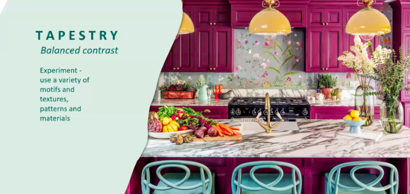
Color experts from Sherwin-Williams and Pantone gave the design industry a look into the future with the Sherwin-Williams Colormix Forecast and the Pantone Color of the Year.
During a presentation last month, Lois Clark, senior designer account executive at Sherwin-Williams, shared the company’s color of the year, along with palettes of shades that will influence interior design in 2021.
“Our color of the year is Urbane Bronze,” she said. “And with that and our palettes, we’re focusing on the role of color in design and in our lives.”
Rooted in nature, Urbane Bronze is a deep brown/gray shade that captures the transition from gray tones to the browns that are coming into prominence in design.
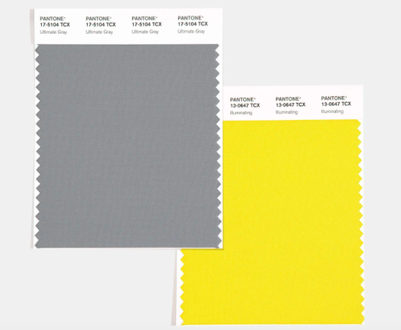
Gray also figures in Pantone’s Colors of the Year, Ultimate Gray and Illuminating—a soft pebble gray and a cheerful, sunny yellow.
“The selection of two independent colors highlight how different elements come together to express a message of strength and hopefulness that is both enduring and uplifting, conveying the idea that it’s not about one color or one person, it’s about more than one. The union of an enduring Ultimate Gray with the vibrant yellow Illuminating expresses a message of positivity supported by fortitude,” said Leatrice Eiseman, executive director of the Pantone Color Institute. “Practical and rock solid but at the same time warming and optimistic, this is a color combination that gives us resilience and hope. We need to feel encouraged and uplifted, this is essential to the human spirit.”
Encouragement and comfort are a few of the emotions influencing the palettes in Sherwin-Williams’ Colormix 2021. Clark said the four color groups—Sanctuary, Encounter, Tapestry and Continuum—speak to the desire for a calmer, more stable world in the wake of the chaos of 2020.
“Celebrating nature by incorporating it into daily living, we’ll see how natural warm and muted tones have a remarkable ability to nurture our souls,” said Clark. “We’re learning to take pause and see how our spaces can help us slow down and embrace what’s truly important.”
Sanctuary features warm, earthy neutrals like reddish browns, ochre and mint. The palette is inspired by notions of wellness, nesting and creating a seamless transition between indoors and out.
Inspired by natural materials and a modern bohemian aesthetic, the Encounter palette includes shades like camel, evergreen, khaki, mushroom brown and deep blues like ink and indigo.
Bright, optimistic hues like buttery yellow in joyful, playful patterns mark the Tapestry palette, while aquatic blues, gray and lilac purple give a serene quality to the Continuum palette.
Across the board, color trends in 2021 promise to infuse the home with a sense of much-needed calm coupled with a dose of optimism that better days are ahead.