Rebranding seeks to change perceptions about the line among retailers and consumers

HIGH POINT — Case goods resource Legacy Classic Furniture is rebranding and remerchandising its line to reflect a broader presentation of style offerings that crosses from classic traditional to modern.
Legacy Classic/Modern is the new name of the company moving forward. While nodding to the company’s classic lineage, it also represents its modern and contemporary-leaning design approach in its collections and freestanding product lines.
The company also is renaming its Legacy Kids brand to Legacy Kids/Teens to reflect its incorporation of designs in youth furniture that cross into the teen and young adult years. Thus the company aims to extend the life of the groups, offering mature styles that can grow with the child from their pre-teen and teen years to when they get their first apartment.
This is not necessarily a brand new design strategy for Legacy. For many years, the company has offered a broad range of styles in adult and youth furniture, in some cases building full collections from youth bedrooms and vice versa. But it wanted its name to reflect this approach so that the brand was not segmented into a single design aesthetic or age group among dealers and consumers shopping for furniture online.

“I would say the big change is adding modern as a defined marketing and merchandising avenue,” said Neill Robinson, president and CEO. “It just means that we are better merchandised overall as a company.
“And when we look at our product line as a whole, we can fill out the different buckets of style categories that are relevant. So what I mean by that is every market we would like to have a whole home collection in classic and a whole home collection in modern…I just think when you are driving in those two merchandising lanes, it helps you to round out the line.”
He noted that the classic moniker represents anything with classic architectural elements.
“That goes all the way from transitional to formal 18th century and everything in between including coastal, casual rustic and cottage,” he said. “There’s a huge amount of categories you can be in with classic.
“It’s the same thing within modern. You can play in contemporary and high sheen lacquer,” he added noting that the category also complements SKUs such as wall beds and groups bearing metal accents and other types of mixed media.
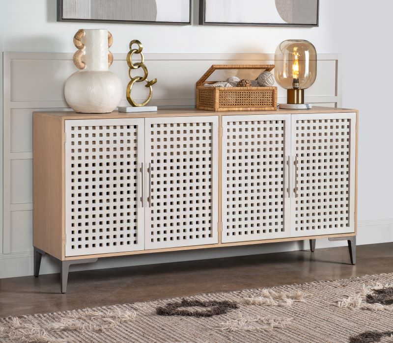
Two groups the company is launching at the April High Point Market reflect each design aesthetic.
For example, its 30-piece Biscayne collection offers a more modern approach across several key categories including bedroom, dining room, occasional, home office, home entertainment and accent furniture.
Made with quartered oak veneers and hardwood solids in a blonde finish called Malabar, the modern resort-inspired collection has design details such as pierced and basket weave fronts on cabinets, travertine marble inserts, silver metal accents and tapered legs. Other design elements include faux linen-wrapped alabaster door and drawer fronts and matte nickel hardware.
Meanwhile, its 19-piece Camellia collection has what the company describes as “classic architectural bones.” It is made with birch and cathedral white oak veneers in a casual two-tone Vintage White finish on cases and a Cobble Brown finish on the tops that highlights wood grain patterns. Classic design elements include fluted carving details on selected drawer fronts and Empire-inspired legs. Spanning bedroom, dining, occasional, home office and home entertainment, it also features hardware in a Blackened Bronze finish.
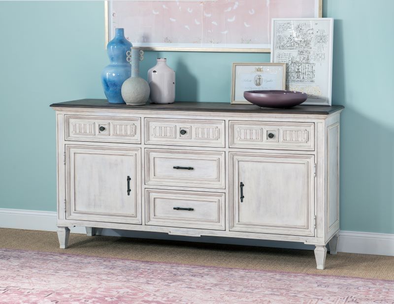
“They are both very saleable, very on trend new collections, but they are also both very definable as classic and modern,” Robinson said.
At the April Market, these two collections, will be showcased in the company’s 50,000-square-foot showroom at 2622 Uwharrie Drive in High Point. Just over half of the space will be dedicated to Camellia and other inline collections within the classic design realm.
Biscayne and others that fall within the modern aesthetic will be showcased in a separate dedicated area of the showroom. The company’s licensed Rachael Ray Home line also has products in each style category.
These two areas will be separated by a space devoted to freestanding dining sets.
With the Legacy Kids/Teens line, also shown at the Uwharrie Road showroom, Robinson added that the goal is to “create a product that offers the consumer an image of being a little more evergreen. Their child is going to want to have this longer. We need the consumer to have this perception that this is something they will take to their first apartment someday. This is real furniture, not disposable kids furniture.”
At the same time, he said, the youth and teen line also will continue to have a design aesthetic that allows boys, girls and unisex groups to easily fit into a second bedroom or guest bedroom. Robinson added that the groups also will continue to have all the categories covered for “what kids need” including bunk beds and loft beds as well as smaller scale nightstands with lighting and power functionality.
“But we can do it with scaled down adult designs,” he said, noting that its bestselling Rachel Ray bedroom, Chelsea, started as a youth group, while other groups started as bedroom and dining room collections but later evolved into youth. “And they do really well.”



.jpg)


